BRNT Designs
Photography for website launch, with seasonal updates
Project
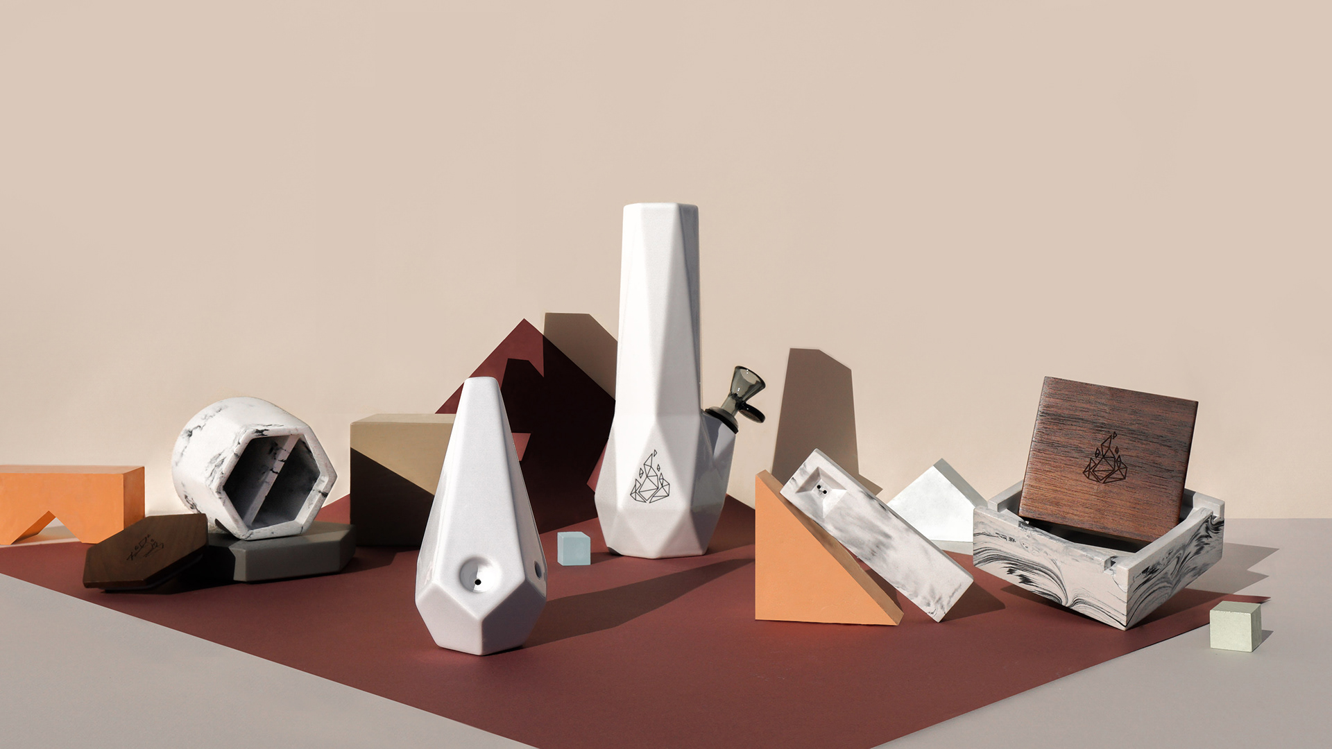
Bring to life BRNT Designs brand guidelines through photography, supporting online sell-through. Content must answer past feedback given to BRNT Design by their fans, and all communication channels must be taken into account.
BRNT Designs is made up of creatives and design thinkers dedicated to reshaping the cultural undercurrent that has historically impacted the way cannabis products are used, enjoyed, shared and displayed in the home. This means that the photography cannot show past stereotypes of stoner culture.
Challenges:
- Canadian Cannabis Regulations for marketing
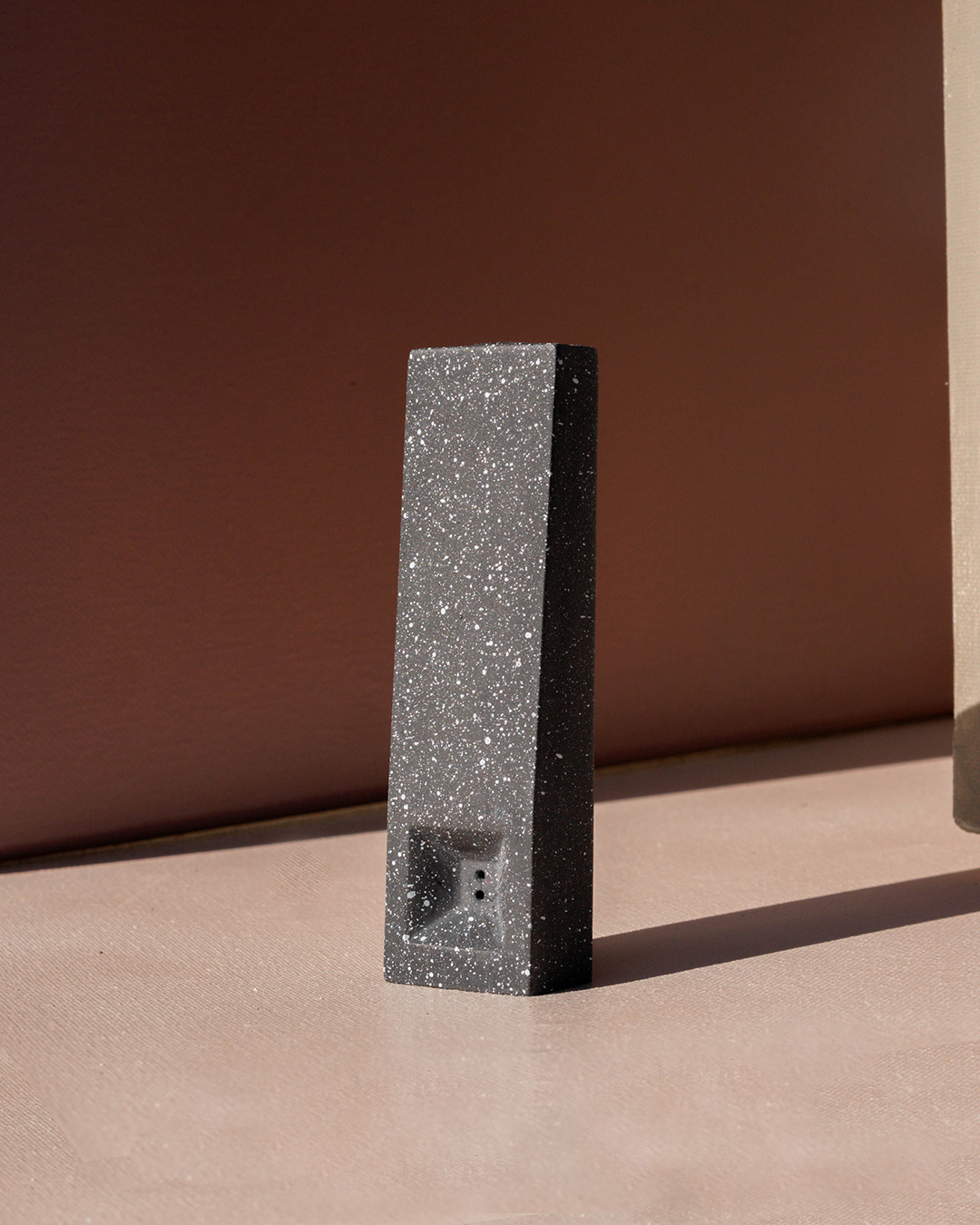
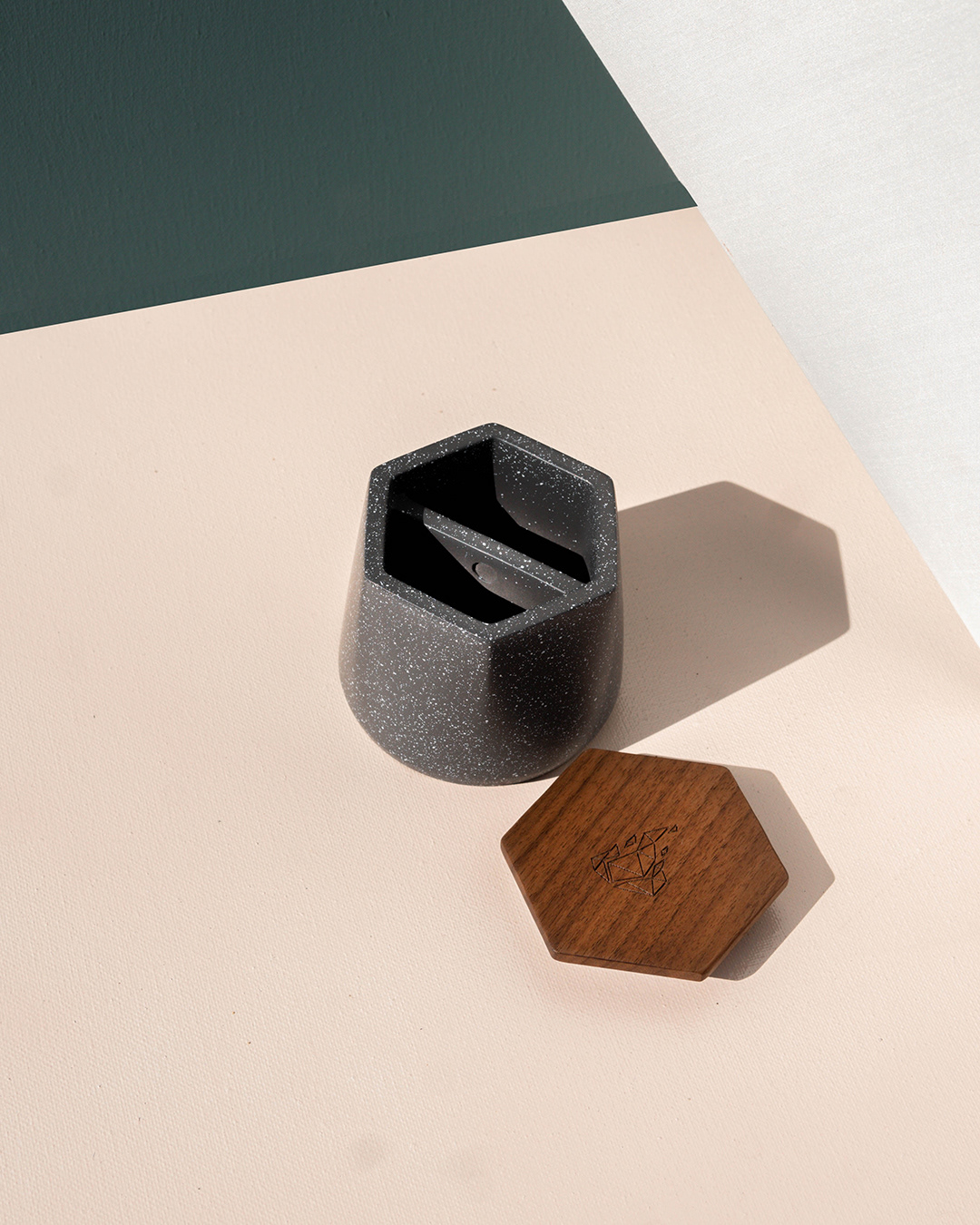
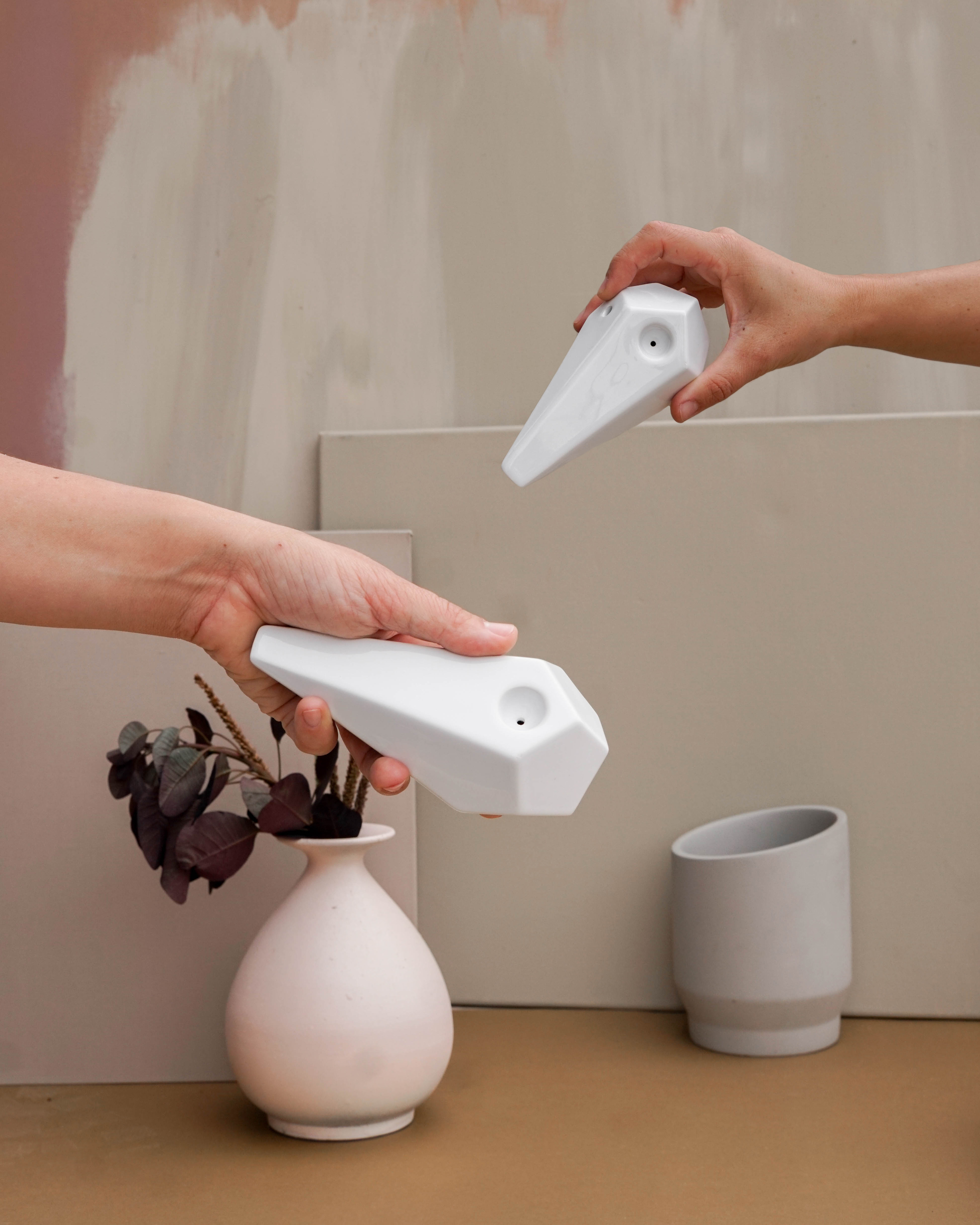
- Showing scale while adhering to a tight minimalist aesthetic
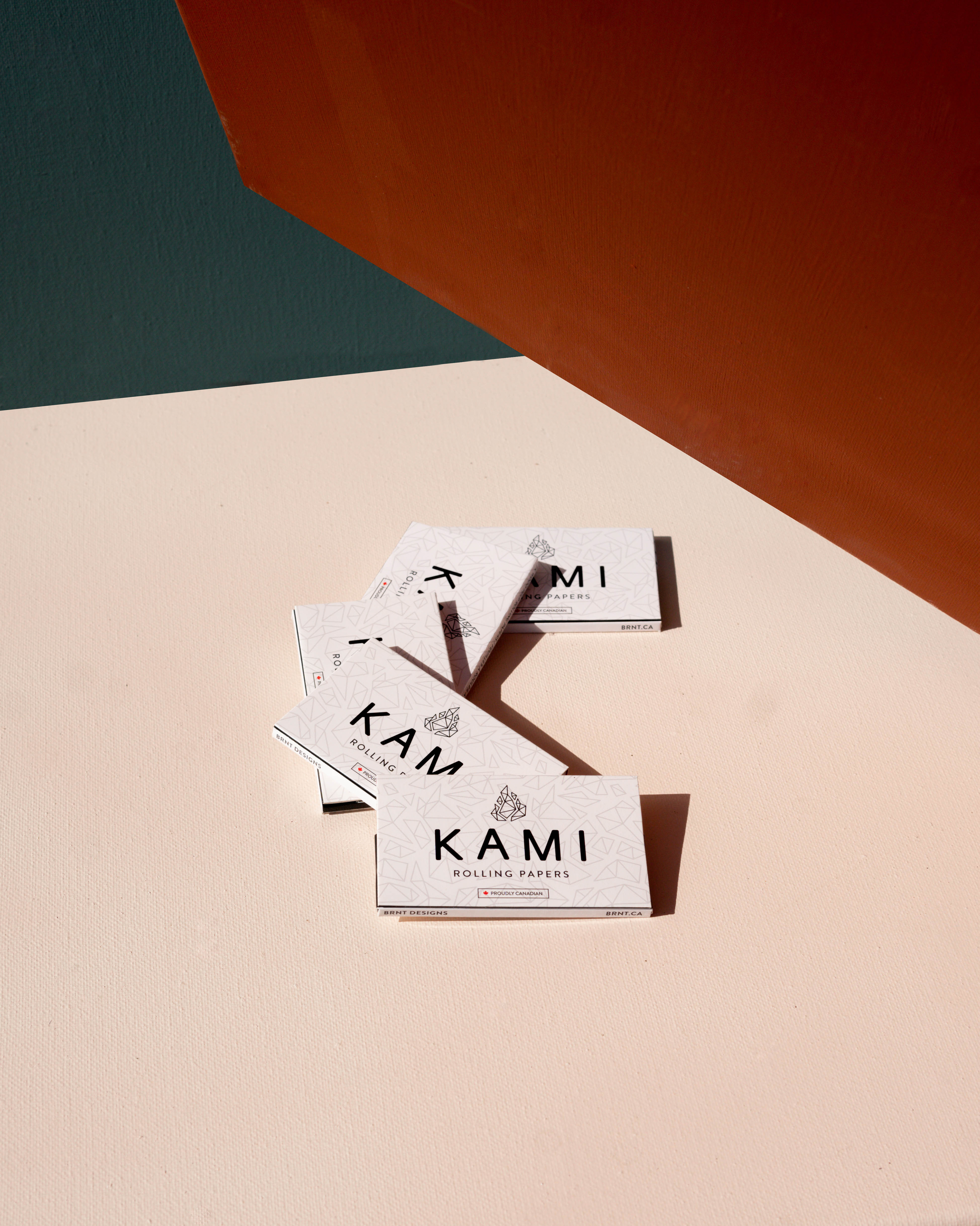
- Creating evergreen images that can be used across web, social, email marketing, and PR opportunities.
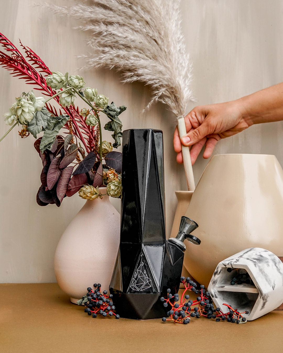
- Ability to layer in seasonal images without alienating original evergreen content, making it simple to mix when needed.
Evergreen Minimalist
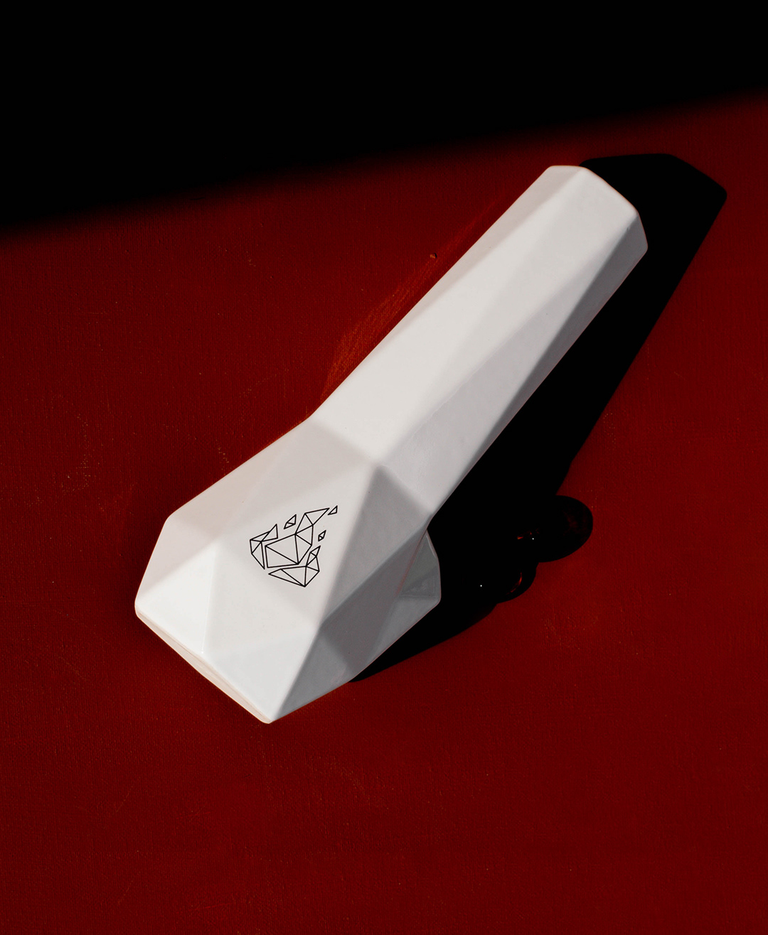
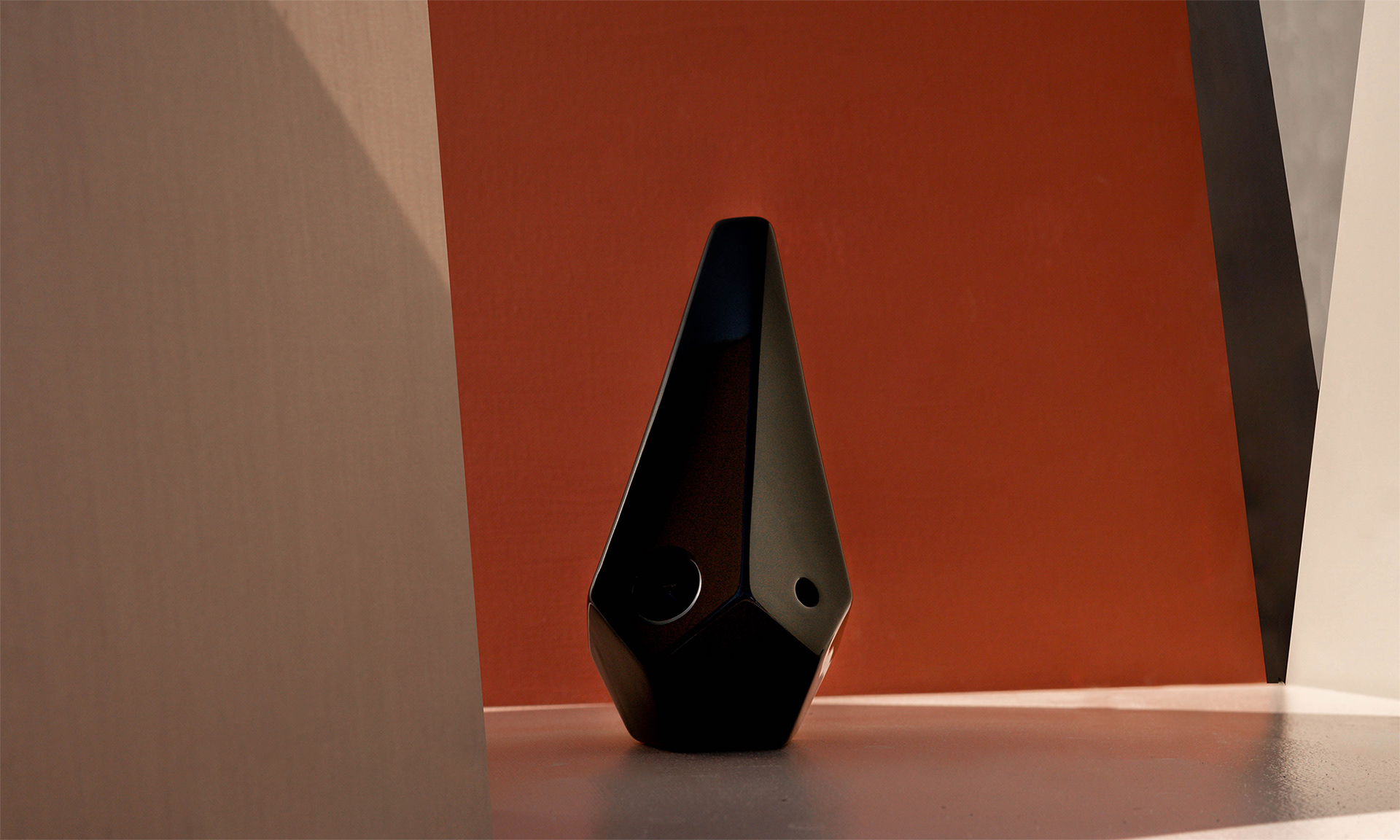
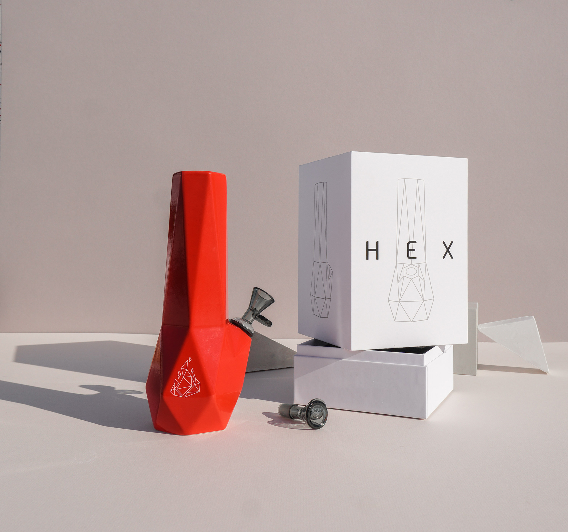
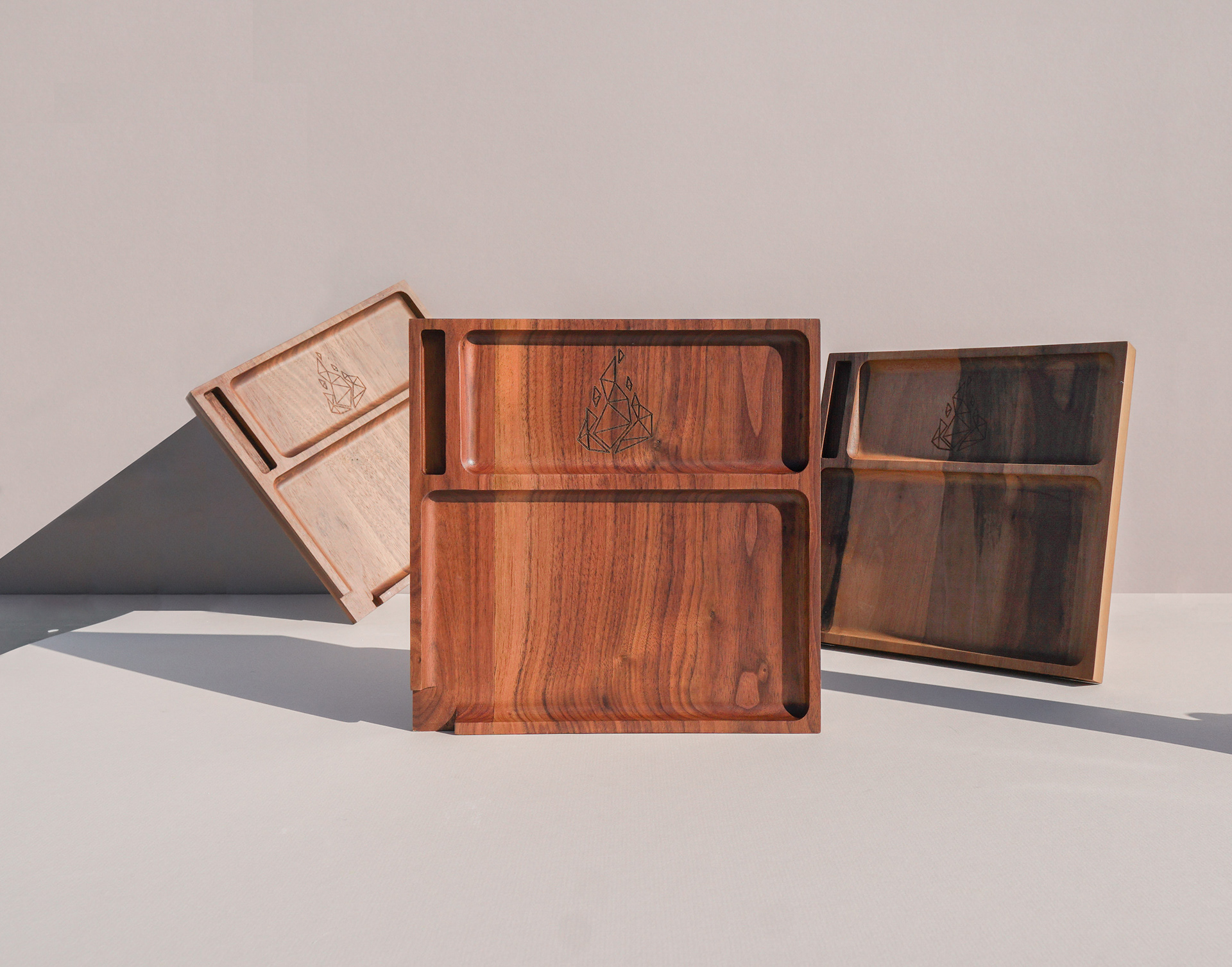
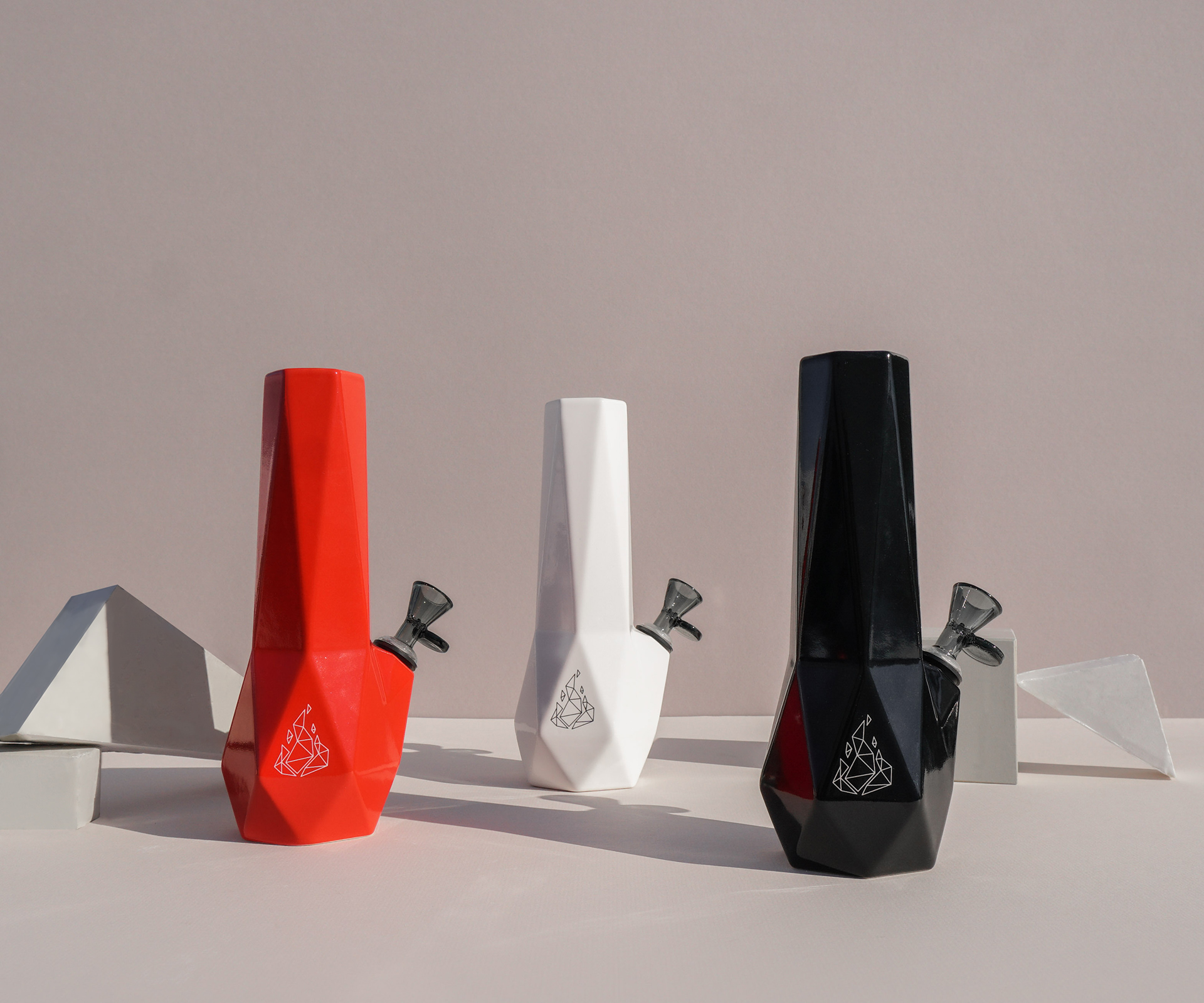
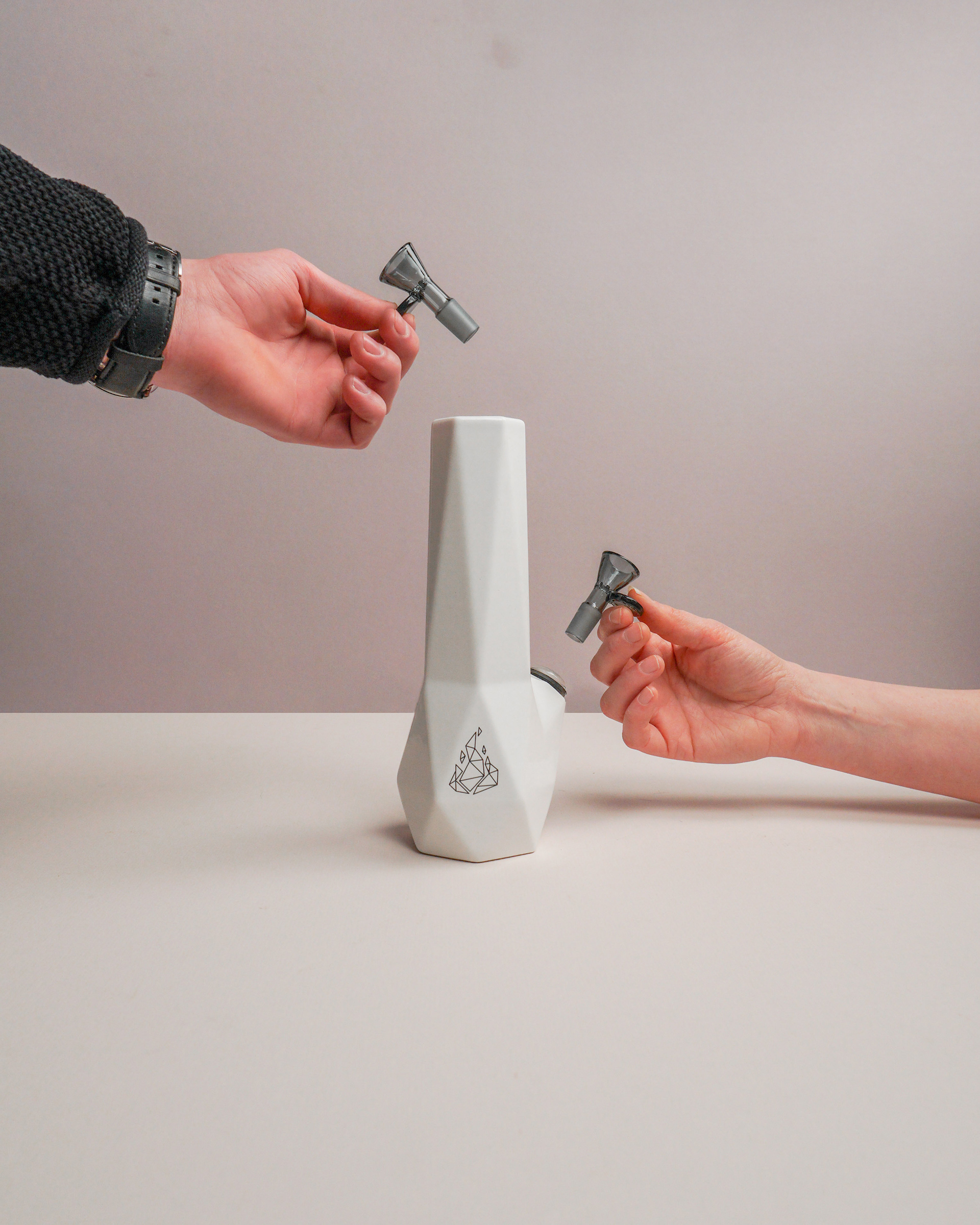
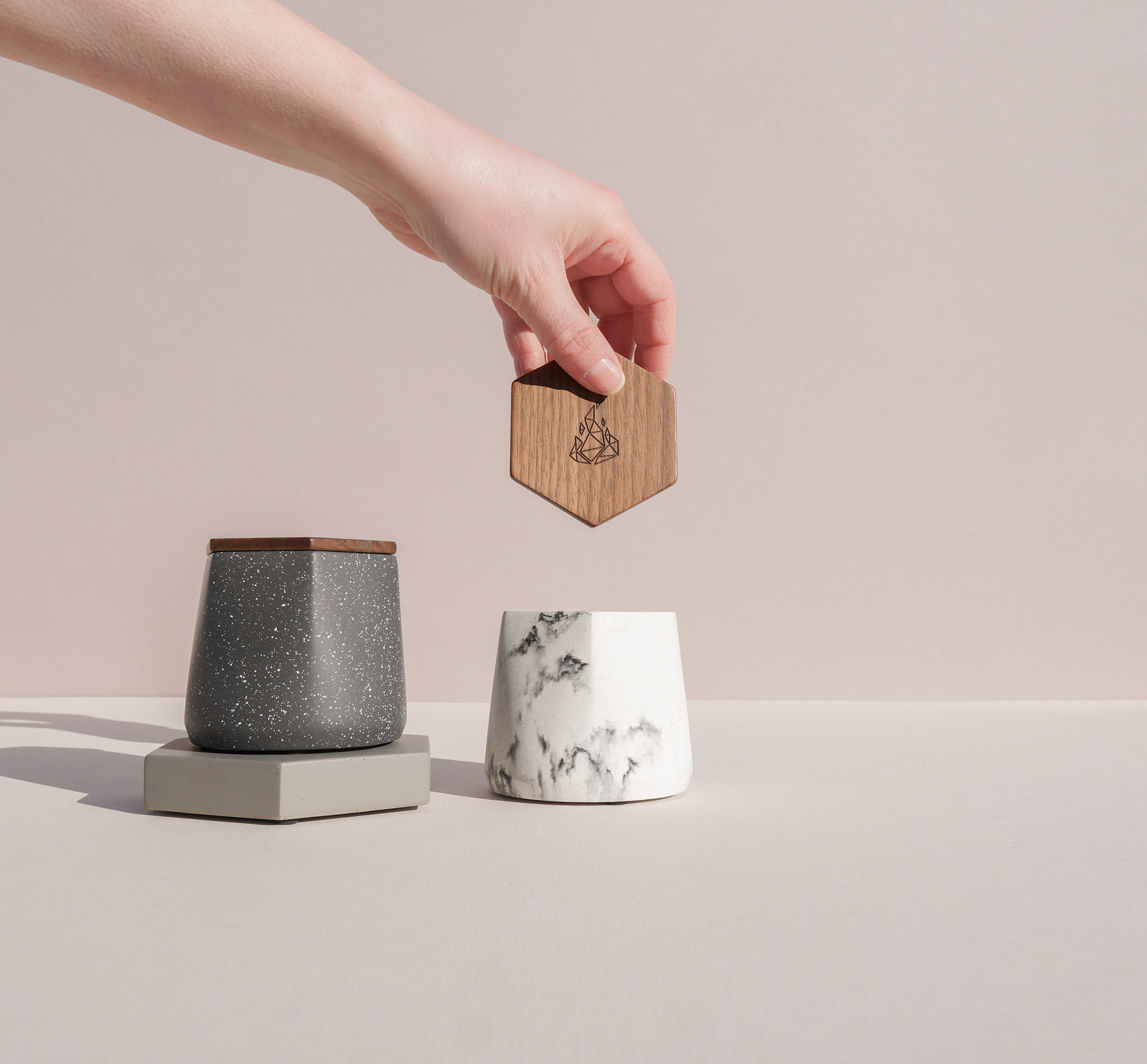
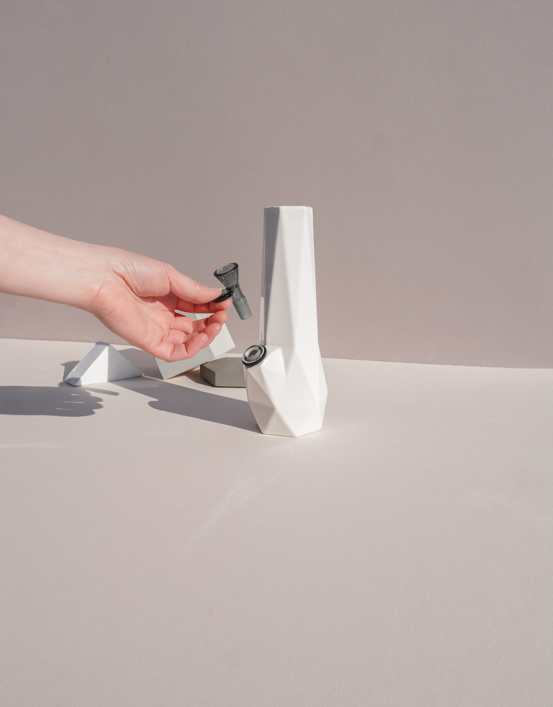
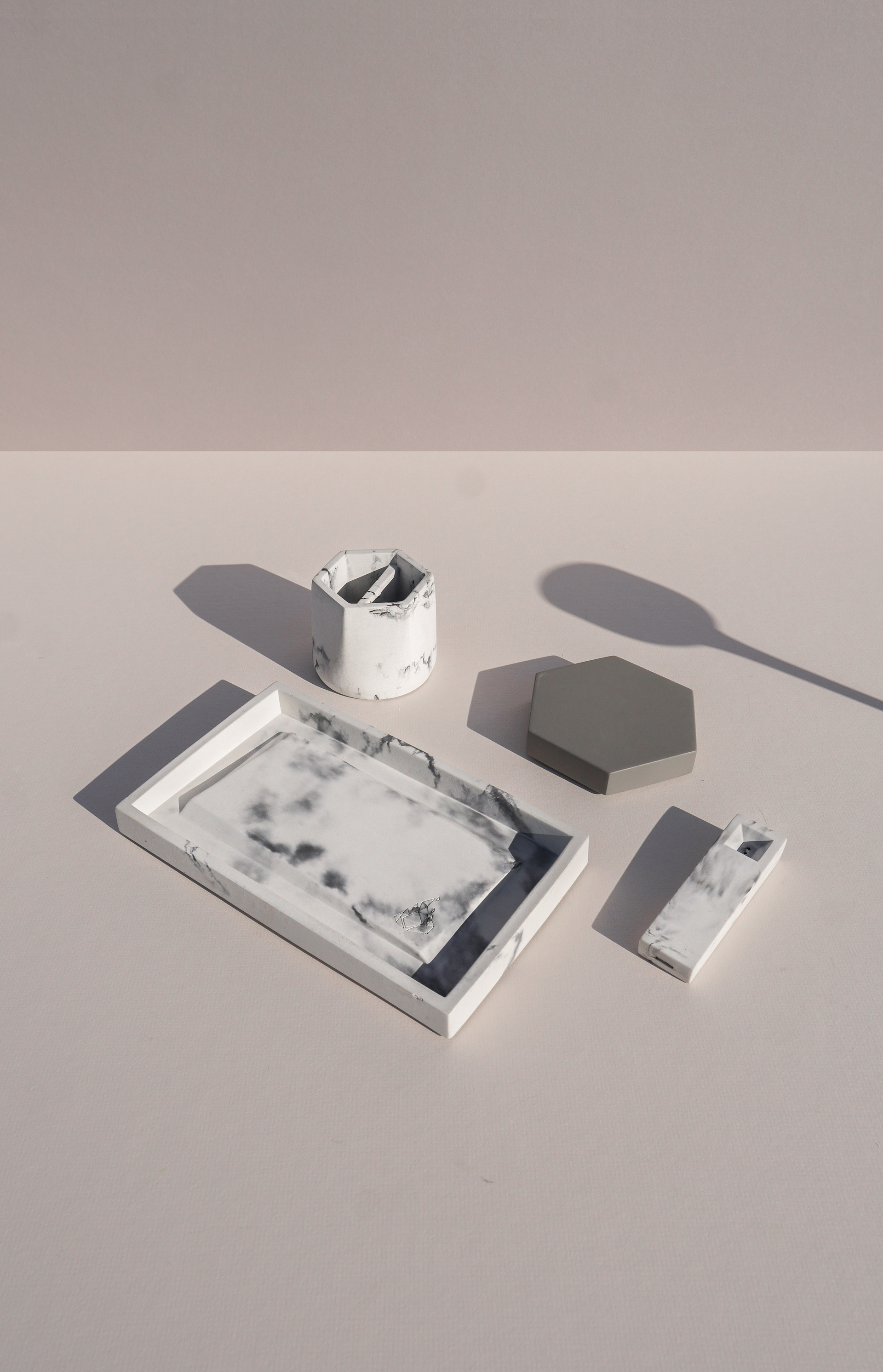
The relaunch of the website was focused on helping the viewer see the product as design forward and minimalist, while including opportunities to gauge scale and possible pairing or add ons when shopping.
Evergreen content is not changed on the product pages of the BRNT Design website. Seasonal images are updated on the homepage and used on social media channels to support campaigns and highlight the current brand focus.


Seasonal Update
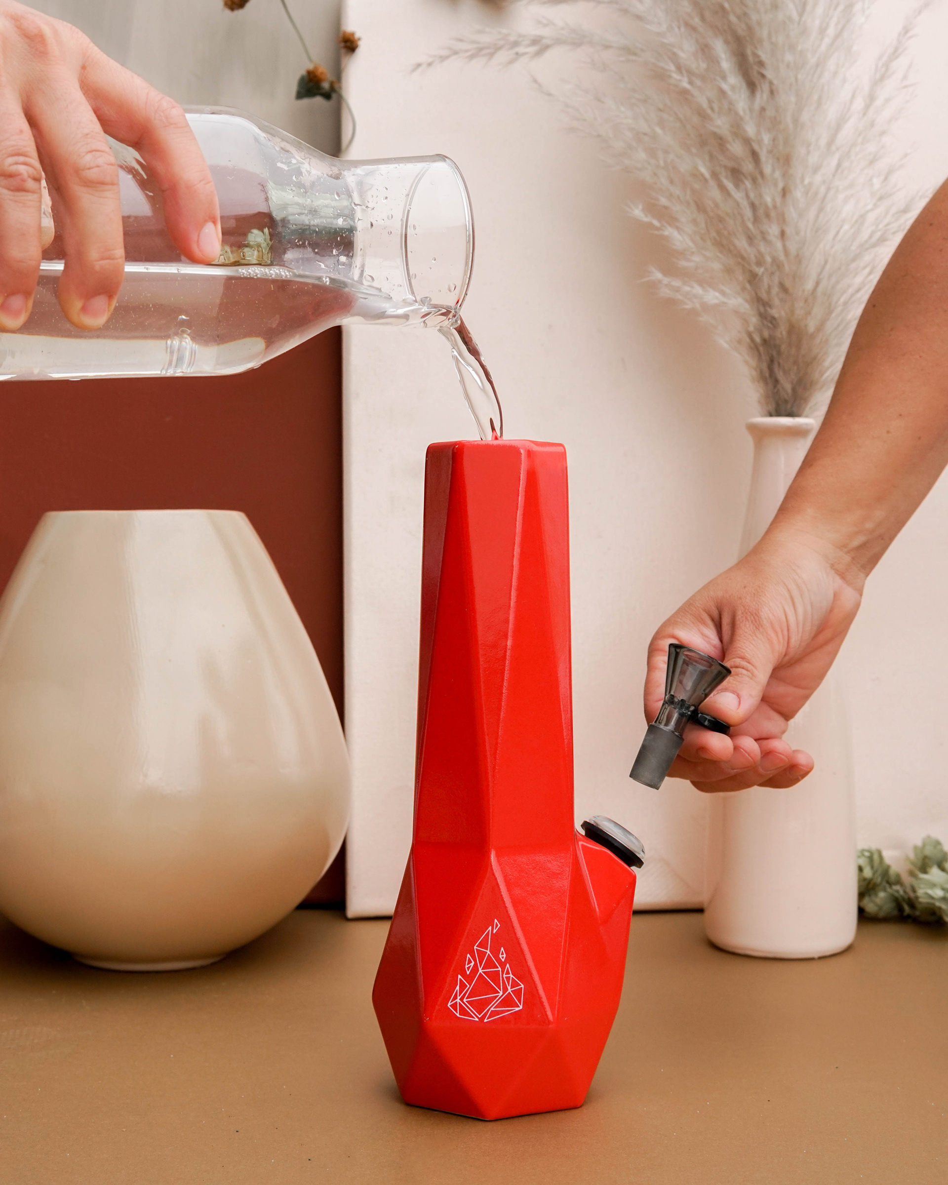
Fall winter 2020 used many of the same tactics as the evergreen, but included a new minimal palette that complimented the product and evergreen content. Included were hands for helping see product size, and fall themed props that didn't detract but rather added pops of texture when viewed in a grid, or on the home page of the website.
